
2.2 Histograms, Frequency Polygons, and Time Series Graphs
Histograms
A histogram is used to describe quantitative data. It is suitable for displaying large number of data values. Heights of bars (rectangles) of histograms represent frequencies or relative frequencies and adjacent bars touch each other. The histogram (like the stemplot) can give you the shape of the data, the center, and the spread of the data.
A frequency is the number of times a value of the data occurs. It's the count of that data-- how many of them are in the dataset?
Frequency table (Frequency Distribution) lists each unique data value in one column and their corresponding frequencies in the next column.
A relative frequency is the ratio (fraction or proportion) of frequency of a data value and the total data set size (the number of raw values in the data set):\[ \textrm{Relative frequency}\:=\:\frac{\textrm{Frequency}}{\textrm{Total Frequency}}\]
Cumulative frequency is the accumulation of the previous frequencies. Cumulative relative frequency is the accumulation of the previous relative frequencies.
Relative and Cumulative Frequencies
Practice
Making a Frequency Histogram
Click on the following topics to view videos explaining the listed concepts. You can then try to follow them using your own choice of calculator from the list of Calculators required for the course.
Lower and Upper Class Limits, Class Width
Midpoints, Class Boundaries
Another Look: How to Make a Histogram?
For drawing histograms with grouped data, we can use the midpoints of each class or the lower limit of each class.
Using Technology to Create Histograms
Online calculators such as Desmos and StatKey can do a great job of creating neatly drawn histograms. Ti 83/84+ calculator can also be used to draw histograms on your calculator.
Example: The following data represent the number of employees at various restaurants in New York City. Using this data, create a histogram.
\[22,35,15,26,40,28,18,20,25,34,39,42,24,22,19,27,22,34,40,20,38,28\]
Use 10–19 as the first interval.
On Desmos, you can enter your data as [latex]L=[22,35,15,26,40,28,18,20,25,34,39,42,24,22,19,27,22,34,40,20,38,28][/latex]. Make sure to separate each value with a comma. Desmos will now recognize this data set as [latex]L[/latex]. In the 2nd input box, enter histogram(L, 10). Bin width is the same as class width. Make sure to change the BIN ALIGNMENT to Left to see the following.
Histograms on Desmos - Interactive Example
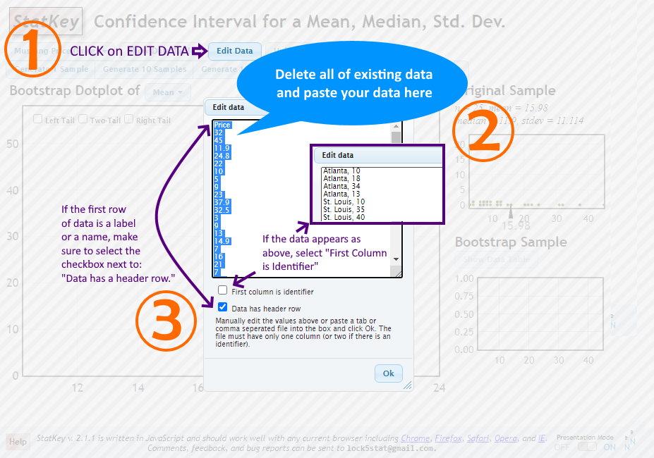
On StatKey, select One Quantitative Variable from the main page and click on Edit Data button to enter our data for the question. Make sure to enter the data values one value per line (unlike with Desmos). You can uncheck both the checkboxes on the Edit Data window but if your data includes the variable name in the first row, be sure to select Data has a header row checkbox.
How to Edit Data on StatKey?
After your data entry, the default graph shown will be a dot plot. Select the histogram tab to see the histogram. Click on the Set Limits box and change values until you see the histogram as the one above from Desmos output.
On a Ti83/84+, you can follow the steps in the OpenStax Statistics textbook or watch this video: Histogram on Ti Calculator.
Frequency Polygons
Frequency polygons are analogous to line graphs, and just as line graphs make continuous data visually easy to interpret, so too do frequency polygons.
Frequency Polygons and Histograms for Grouped Data
Practice
Time Series Graph
A graph that displays data with chronological ordering. The horizontal axis is for time and the vertical axis records the data values for the variables recorded at different times in chronological order. By doing this, we make each point on the graph correspond to a date and a measured quantity. The points on the graph are typically connected by straight lines in the order in which they occur.
Drawing Time Series Graphs
