
2.1 Stem-and-Leaf Graphs (Stemplots), Line Graphs, and Bar Graphs
We start this unit with some formal graphical and numerical ways to describe and display data so that we can make sense of them. Learning how to interpret graphs and numerical summaries will provide a better glimpse of the scenario that these data represent. This area of statistics is called Descriptive Statistics.
A statistical graph is a tool that helps you learn about the shape or distribution of a sample or a population. A graph can be a more effective way of presenting data than a long list of data values. Statisticians often graph data first to get a picture of the data. Then, more formal tools may be applied. Numerical summaries such as the average, median, or mode, can also give can add clarity to our understanding of the data.
Since we’ll be doing calculations, let’s first decide on how and when to round values in our calculations.
Answers and Rounding Off
- A simple way to round off answers is to carry your final answer one more decimal place than was present in the original data.
- Round off only the final answer. Do not round off any intermediate results, if possible. If it becomes necessary to round off intermediate results, carry them to at least twice as many decimal places as the final answer.
Need a refresher on rounding? Rounding Explained
Graphical Descriptions of Data
Data that is not organized is referred to as raw data. Data may be organized by using Tables, Graphs, Numerical Summaries, to name a few.
Graphical Descriptions of Qualitative (Categorical) Data
Tables are a good way of organizing and displaying data, but graphs can be even more helpful in understanding the data. Two graphs that are used to display qualitative data are pie charts and bar graphs.
In a pie chart, categories of data are represented by wedges in a circle and are proportional in size to the percent of individuals in each category. Categories must add up to 100%.
Bar Graphs
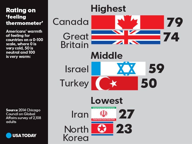
Bar graphs consist of bars that are separated from each other. The bars can be rectangles or they can be rectangular boxes (used in three-dimensional plots), and they can be vertical or horizontal. The heights of the bars represent the frequencies of the categories. In a bar graph, the length of the bar for each category is proportional to the number or percent of individuals in each category. Bars may be vertical or horizontal. A bar graph is appropriate to compare the relative size of the categories.
Understanding Bar Graphs
Detailed data: Under age 25 – 61.0%; Intend to transfer – 48.6%; Full-time – 40.9%; All students – 100%.
A Pareto chart is a bar graph with bars that are sorted into order by category size (largest to smallest).
| Age groups | Number of Facebook users | Proportion (%) of Facebook users |
|---|---|---|
| 13–25 | 65,082,280 | 45% |
| 26–44 | 53,300,200 | 36% |
| 45–64 | 27,885,100 | 19% |
Detailed data: Ages 13-25: 45%; Agers 26-44: 36%; Ages 45-64: 19%;
Pictographs
Pictographs use visual images to display information about data.
NOTE: It is a good idea to look at a variety of graphs to see which is the most helpful in displaying the data. We might make different choices of what we think is the “best” graph depending on the data and the context. Our choice also depends on what we are using the data for.
Graphical Descriptions of Quantitative (Numerical) Data
Dot plots
A graph that displays individual data values using dots over a number line. Repeated data values are represented by stacked dots.
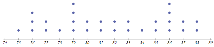
What are the data values that were graphed on the above dotplot?
PRACTICE
Follow the links below to check your knowledge on the topic:
Stem-and-Leaf Plots (Stemplots)
Stemplots are used to display quantitative data. Typically, the right-most digit is the leaf while the rest represent the stem. It's important to include the key for the stemplot so that the data values can be correctly interpreted. In the stemplot below, the key tells us that 1|7 is 17 and not 1.7 or 1700 with data represented in hundreds, etc.
| STEMS | LEAVES Key: 1|7 represents 17 |
|---|---|
| 0 | 667778999 |
| 1 | 02447778889999 |
| 2 | 0011234445667889 |
| 3 | 00011224 |
Stemplots can be useful in observing the distribution of data, any clusters, peaks, etc.
Quick manual sorting of numerical data using Stemplots: Stem & Leaf Plots
Stem and Leaf plots Explained
PRACTICE
Line Graphs
In a line graph, the x-axis (horizontal axis) consists of data values and the y-axis (vertical axis) consists of frequency points. The frequency points are connected using line segments.
|
Interpreting Line Graphs
Optional: Line Graphs and More in Microsoft Excel
