Applying Your Skills: Blog Post, Infographic, and Self-Review
Now it’s time to put your communication skills into action. To complete this section, you will choose and complete ONE of the two activities below. Both options allow you to demonstrate your understanding of key communication competencies while providing flexibility in how you showcase your skills.
Each activity is designed to align with the principles of Universal Design for Learning (UDL), meaning you have the freedom to select the format that best suits your strengths and interests. Within your chosen activity, you may also encounter additional choices to further personalize your learning experience.
Once you have successfully completed your chosen activity, follow the instructions to review your work using the provided self-assessment criteria and submit your final version within the forms below.
If you have any questions during this process, feel free to reach out to Dr. Christine Crefton at christine.crefton@montgomerycollege.edu for guidance.
Select ONE of the following activities:
Option 1: Blog Writing Assignment – Craft a well-researched and engaging blog post on a topic of interest, using structured guidelines and self-assessment to refine your work.
Option 2: Digital Infographic Creation – Design a compelling infographic that visually represents a concept, either independently or as an extension of a blog post topic.
Both activities are equally valid ways to demonstrate your communication competency—the choice is yours!
Activity 1. Blog Writing Assignment
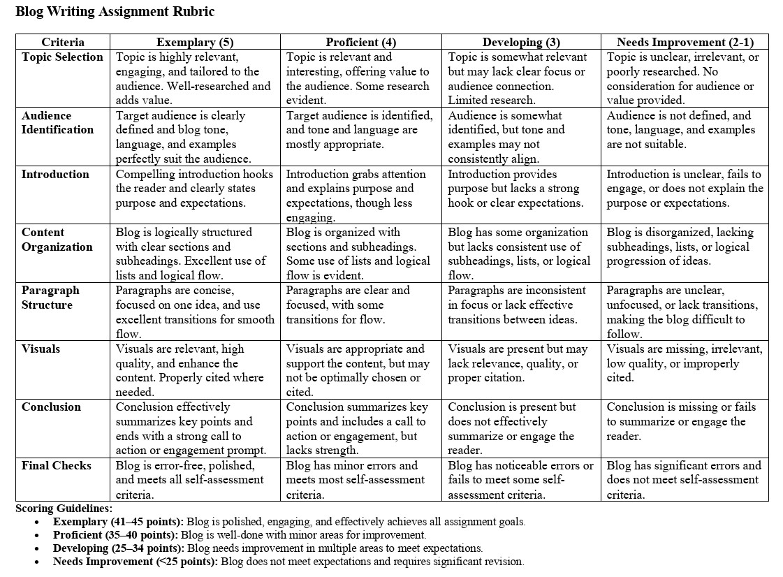
Instructions: Write a well-researched and informative blog post on a subject of interest. Follow the checklist below to ensure your blog is clear, engaging, and well-structured. You may choose your own topic or select from the list of ideas provided. After completing your blog post, you will assess it using the self-assessment criteria.
Topic Selection:
- Choose a topic that interests you and is relevant to your intended audience.
- Ensure the topic allows for well-researched content and offers value to your readers.
Optional Ideas:
-
- How to stay productive in a remote work environment
- The benefits of mindfulness for stress management
- Sustainable living: Simple changes for a greener future
- A guide to effective time management
- The impact of social media on mental health
- Exploring the future of renewable energy
- The importance of diversity and inclusion in the workplace
- Healthy eating habits on a budget
- The role of technology in education
- The art of public speaking: Tips for success
Checklist for Creating Your Blog Post:
Audience Identification
- Clearly define your target audience (e.g., students, professionals, hobbyists, etc.).
- Tailor your tone, language, and examples to suit your audience.
Introduction
- Write an attention-grabbing introduction to hook your readers.
- Clearly state the purpose of your blog and what readers can expect to learn.
Content Organization
- Break your blog post into organized sections with clear subheadings.
- Use bullet points or numbered lists where appropriate to make the content easy to scan.
- Ensure that each section builds on the previous one, leading to a logical conclusion.
Paragraph Structure
- Write concise paragraphs that focus on one idea at a time.
- Use transition words and phrases to create a smooth flow between ideas and sections.
- Keep your sentences clear and to the point, avoiding jargon or overly complex language.
Visuals
- Incorporate at least one relevant visual element (e.g., images, charts, or graphs) to support your content.
- Ensure your visuals are high quality and appropriately cited if necessary.
Conclusion
- Summarize the key points of your blog post in the conclusion.
- End with a call to action, question, or thought-provoking statement to encourage reader engagement.
Final Checks
- Proofread your blog post for spelling, grammar, and punctuation errors.
- Ensure that your blog post meets the criteria provided in the rubric.
Use the self-assessment prompts provided on the form below to evaluate your writing. Make any necessary revisions before submitting your final version.
Here is the rubric that will be used for assessing your submission.
Activity 2. Digital Infographic Creation Assignment
Instructions: Design a digital infographic that visually explains a complex concept. Your infographic should build upon the topic of your blog post, providing a complementary visual representation of your content. You can use any design platform, but here are some recommended free tools to help you get started. Each platform offers free infographic templates and user-friendly features for creating professional-quality graphics, even if you need more design experience.
Recommended Tools:
- Canva
Canva is a versatile design platform for creating various types of media, including presentations, blog graphics, posters, and infographics. It offers a user-friendly drag-and-drop interface for customizing free infographic templates. Once you’re satisfied with your design, you can download it in multiple formats for easy sharing. - HubSpot
HubSpot offers a set of free, customizable infographic templates designed to simplify the creation process. The templates are available in PowerPoint format, allowing you to replace text and adjust colors to match your brand’s palette. HubSpot also provides a color palette generator to ensure cohesive branding across your visuals. - Piktochart
Piktochart is an intuitive tool that helps users create infographics without any prior design experience. The free version includes access to various chart types, including pie charts, maps, and bar charts, which you can populate with data from a CSV, Google Sheet, or Excel file. Piktochart’s emphasis on data visualization makes it an excellent choice for turning complex information into understandable graphics. - Snappa
Snappa is known for its speed and simplicity, claiming users can create infographics in just five minutes. The platform provides free infographic templates and a drag-and-drop builder, making it easy to customize your design with graphics, text, and stock images. Once finished, your infographic can be downloaded and shared in different formats, with social sharing options available as well. - Venngage
Venngage offers a drag-and-drop editor to help users create infographics with no design experience. The platform includes a robust stock photo library with over 40,000 icons and images, plus 3 million additional assets from Pixabay. However, some features, like the collaboration tools and brand kit, are only available with paid plans. - Visme
Visme allows users to create infographics in three easy steps: choose a template, input your data, and customize. For more flexibility, you can also use design blocks to build your infographic piece by piece. Once completed, you can share your work via a link or download it in various formats. While the basic version is free, certain features, like the brand kit, are available only with paid plans.
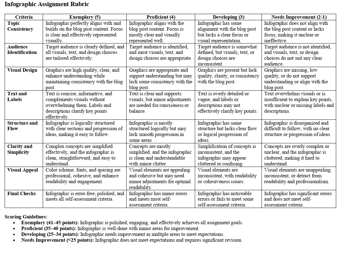
Checklist for Creating Your Infographic:
Topic Consistency
- Ensure that your infographic builds on the content of your blog post.
- Choose a focus within your blog topic that can be effectively represented visually.
Audience Identification
- Clearly define your target audience, consistent with your blog post.
- Tailor your visuals, text, and design choices to suit your audience.
Visual Design
- Use clear, high-quality graphics that enhance understanding of the content.
- Ensure your visual elements are consistent in style and theme with your blog post.
Text and Labels
- Write concise, informative text that complements the visuals without overwhelming them.
- Use labels, captions, or short descriptions to clarify key points.
- Maintain a balance between text and visuals, ensuring that neither dominates the infographic.
Structure and Flow
- Organize your infographic with a logical flow that guides viewers through the information.
- Use sections, arrows, or other design elements to indicate the progression of ideas.
- Ensure that your infographic is easy to follow, with a clear beginning, middle, and end.
Clarity and Simplicity
- Simplify complex concepts so they are easily understood by your audience.
- Avoid clutter; make sure your infographic is visually clean and straightforward.
Visual Appeal
- Use an appropriate color scheme, fonts, and spacing that are visually appealing and enhance readability.
- Ensure that all visual elements work together to create a cohesive and professional look.
Final Checks
- Proofread all text for spelling, grammar, and clarity.
- Check that your infographic aligns with the self-assessment criteria and the provided rubric.
Use the self-assessment prompts provided on the form below to evaluate your infographic. Make any necessary revisions before submitting your final version.
Here is the rubric that will be used to assess your submission.